


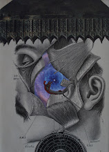
I think this is a cool example of what I am looking at (for) when I am looking at the elements as I create a piece. Notice the three different placements of the dark circle element in the lower right hand portion of this collage. Two of the placements "don't work". The placement of the circle in exact center of the 3 x 3 matrix of the checkerboard pattern creates the illusion of a hint of a bigger square element. Interesting perhaps... but I thought it carried too much visual "weight". The other placement makes the edge of the circular element a bit obscure because it's placed against the dark squares within the checkerboard. The third placement worked best for my purposes, because it allowed just enough "weigh" to the element without drawing too much or too little attention. Do you agree? Enjoy.


No comments:
Post a Comment