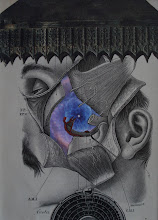
Inspired partly by a piece I had done years ago (2012), which was entitled, "The Question"; and partly inspired by some elements I had "laying around", which had the appropriate patina -- I present the first finished piece of 2026, entitled "Another Question"...
Monday, January 19, 2026
Friday, January 16, 2026
another collab
I have great anticipatory excitement for a two-person exhibit I will be part of in November at The Other Side (Utica, NY), involving David "RC" Oster and yours truly. David is a phenomenal artist who specializes in highly detailed pen-and-ink drawings of barns and buildings and trains and roller-coasters. His work is exquisite. For our exhibit, he plans to show some of his "fantasy" city-scapes. Interestingly, he uses drawings of real buildings, from real cities, but combines them into his own created city. For example, he might take a sky-scraper from New York, and add another building from Chicago, and one from Philadelphia, to create a fantasy city (with the inclusion of a roller-coaster or a set of train tracks and trains). It's really amazing! For our two-person exhibit, I thought that I might make a "collaborative" piece, by which I would integrate my collage elements into a print of one of his fantasy city-scapes. Here are the prints I obtained from David on which I will experiment with placement of collage elements. I'm excited to explore the possibilities!
Tom Nettle
Here are some photos of the most recent work of my friend and fellow artist, Tom Nettle. I absolutely LOVE the piece. It's entitled, "Seldom is Herd a Discouraging Word".
quickie
Just in case folks are wondering where I'm at with the "problem child" piece I've been writing about (which I kind of doubt); here's a possible small remedy idea for it...
Saturday, January 10, 2026
A new year
Well... here's another incrementally small installment of what's going on with this work-in-progress. I realize that this may be a less-than-exciting post; but it is an interesting twist and a reflection of my creative process. I added another transfer to this composition. I had thought that it "needed" something more than what I had already put down -- maybe for balance. I was tempted to simply leave it the way it was, and consider it finished. But instead, I "messed" with it (I wish I hadn't). I don't think it helped with "balance". In fact, I think it had the opposite effect, in a way. The transfer also left a bit of a ghost outline, which detracts from the transfer effect. I'm not sure now, what I will do to "remedy" the situation. I certainly am not satisfied with it the way it is. I have some ideas -- so "stay tuned". This isn't exactly the way I wanted to kick off the new year... but I am still excited and hopeful for what I think will be a great year of creating art (and music).
Friday, December 26, 2025
Susan Finkelstein
Good art seems to always be associated with a good story. Here's one from a fellow artist -- Susan Finkelstein -- whose work I admire (and I'm so happy to have met her over the last year or two)...
more progress, more choices
Per usual, I've been texting back and forth with my good friend and fellow collage artist Anthony Morgan (from PA) about our collage journey. I am often exhilarated, but sometimes intimidated, by the almost limitless possibilities which collage composition affords... "trillions", as Toeny suggested. I placed the orbs in this piece last night (although haven't tacked them down yet... doing that later today). I realized that I could crop this piece, to make it a smaller composition. I think it conveys a bit of a different "vibe". I'm pretty sure I will retain the original "landscape" version, though (and I have the mat and frame for that). If I do use the longer, landscape version, I am also considering adding one more element -- perhaps another transfer -- to the lower right-hand portion of the piece (where the water flows). I'm not sure it needs another element for "balance", or not. I kind of like it "as is" now. It creates a more "open" vibe, but might seem a little sparse for some viewers. But to tell you the truth... I'm much more concerned that I am satisfied with the composition, rather than being too concerned about a "viewer". We'll see what happens. Interestingly, I also realized that this may be the last piece for 2025. Although artificial, I always find interesting, the concept of "last of one year, and the first of the new year".


