As most of you know, I am an analog collagist -- I use no photocopies or digital elements in my work. Occasionally, I am able to procure duplicate images from multiple copies of a source magazine or book, however. This magazine advertisement for Equitable insurance company is an interesting example. I recently used the element for the "Day in the Life" piece which was the companion of a piece done by my friend and fellow collage artist Anthony Morgan. I also used that element for a piece I did a couple years ago that was accepted into the National Collage Society Annual Juried Exhibition. I hadn't explicitly looked at the earlier piece when I created the "Day in the Life" piece. When I compared the two, I found it quite curious that the angle at which I placed the element was virtually identical -- and not horizontal as the original had been. Interesting, I think. That particular angle for that element just seems natural to me.
Saturday, February 20, 2021
Wednesday, February 17, 2021
"Ona"... a Modigliani follow-up
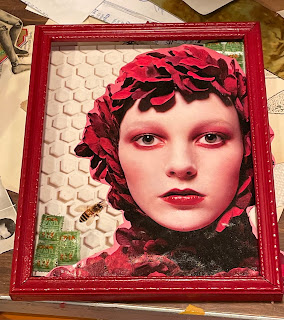
So, here is the finished piece. It is entitled "Have you met Ona, Modigliani's Great Grand-Daughter?". For those of you who may be unfamiliar with Amedeo Modigliani's beautiful paintings, I have included a couple here. As you can see, I "channelled" Modigliani's signature eye treatment for my collage. I am pleased with how it worked for this piece. The "ONA" on the stamps, I think were 'store-specific' back in the day when these "green stamps" were being used by grocery stores as a marketing gimmick. I actually have no idea whether Modigliani had any children, or grandchildren, for that matter. But as I have written about before, I think titles are an essential component of the creative process.
Saturday, February 13, 2021
Serendipity, Modigliani and eyes
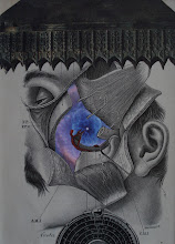
I have often written in this blog, about serendipity as it relates to collage. Last night when I was experimenting, exploring... playing... I was intrigued by these potential elements for collage. One of the problems with using this model's beautiful face, is that I don't know who she is, nor do I want to actually use her entire face "as is". I'm not really worried about legal repercussions related to copyright; I just don't want to use a contemporary photograph (especially of a model) without manipulation. So I decided to "reach back" into my knowledge of art history as a "source" of inspiration. Since the elements are red and green so far, perhaps I would "borrow" from Amedeo Modigliani paintings and use flat green as the interior of the eyes for this piece. Of course, then the challenge is to find the "correct" green (no easy task) from my collection of sources. Here you can see an example of the green I will probably ultimately use. After I carefully "enucleated" the image (i.e., removed the eyes), I thought, "just for the hell of it", I would put the eyeless element over some other elements. THEN, these images emerged when I placed the eyeless element over an image of a pulley system. Wow... weird! There are lots of possibilities, even with just this single image! And if you're a regular reader of this blog, you know I like weird. So I had to share...
Friday, February 12, 2021
"My Money's on Hal"
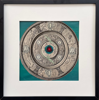
I don't think collages are like children; in that, I think that you can love some of your own collages more than others. I LOVE this collage! And, by the way, I absolutely believe it is okay to love your own work (it's better than not loving it). The piece if 7" x 7" (in an 11" x 11" frame). This has become my favorite and most comfortable size to work with. I think this will be the title of the work (although not certain yet). One of my fellow collage artists said that the piece reminded him of "Hal" from 2001: A Space Odyssey". I had considered entitling it "Jewel", because it reminds me of an intricate Victorian brooch. It has 14 elements and was SO fun to put together. I'm hoping all y'all enjoy as much as I do.
Sunday, February 7, 2021
"Cerebral Tea"
This afternoon, I finished another piece that will go into my solo exhibit it April. This one is 4.5" x 6.5" (in a 12" x 14" frame). I've had this frame sitting around my studio for years. I'm glad it's finally housing a collage!
Friday, February 5, 2021
Uncollage
The "collage" that wasn't a collage. I came across this beautiful image last night in my piles. I had totally forgotten about it. It is from an Italian cultural magazine called "Scena Illustrata", from the early 20th century. Rather than use it as an element in one of my collages, I decided to "simply" mat and frame it. It's a real beauty! I'm giving it to my wife for Valentine's Day. It'll be a perfect addition to her art collection. Interestingly, if you look closely, you will see what I think is a blemish in the painting. Right under the "r" and "a" of "Illustrata", is what appears to be a couple smudges of the yellow paint.


