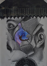
So here are some of the things that I was exploring (experimenting with) on my way to creating the composition that became the final piece I posted previously. Here are the four basic elements that comprised the basic elements:
There are actually two architectural elements (famous buildings, no doubt, but I did not keep track of where they are). They fit together so well, that I wonder if the casual viewer of the piece would be aware that there are actually two architectural elements involved (?).
My original idea was to make this piece completely black and white. But after doing some preliminary work, I decided that I might "open up" the ceiling and perhaps use some galactic element in that space (pun intended). However, I realize I use lots of space/galactic elements, and perhaps it's becoming too cliche. I still experimented with it. The one seen here seemed too colorful for the overall composition. Yes, lots of contrast; but it was eliciting too much visual attention. I then tried something more chromatically subtle, and not technically galactic.
Another decision I had to make was whether both of the woman's arms should be in front of the architectural element. I decided that having both arms commanded too much attention on her body, rather than integrating the other elements. The more pressing "problem" for me was what to do with the center doorway. It was originally black, and that seemed to be okay; but I thought I would explore/experiment a little, by using some of the fabric from the woman's dress as a possible element in that space. Although it looked a little weird, I thought it integrated the elements a bit (I wasn't 100% satisfied with the way that it looked).


My fellow collagist and friend Anthony Morgan, is always busting my chops about the fact that I don't get more collages completed because I am agonizing over all these decisions, so I thought to myself that I am "just gonna go with the fabric option" and put these elements down, and complete the collage! When I went into my studio to finally complete the piece (using the fabric elements), I serendipitously saw this, while I was getting the architectural elements positioned:
I was SO EXCITED... because I was seeing what I would eventually use in this spot in the composition! It's so powerful (and a bit strange), how the architectural elements fit together so beautifully! Careful placement of the "planet" (which is actually not a planet, but "simply" a circular punch from some stratified black-and-white element) would be the final addition. VOILA!


Interesting insights into your thought processes.
ReplyDelete