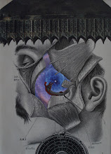
There's an interesting story in the New York Times this morning (June, 23) about book cover art. It's interesting to read about the use and impact of a common strategy used by collage artists -- juxtaposition. Here's an excerpt from the article:
"But the look that’s commanding today’s runways — a.k.a. bookshelves — is not so incendiary. It tends to lay blaringly bright type in a sans-serif font atop a painting, usually a few centuries old but not always. Facial expressions are baleful or dyspeptic; an aggressive burst of spray paint can change the tone entirely.
These covers are the new signifiers of stylish literary fiction, telegraphing gravitas, wit and cool. They make a bid for a certain kind of reader — more city than suburb, more pét-nat than chardonnay. They wouldn’t be caught dead alongside a volume decked out in pop art or, god forbid, metallic lettering.
Thomas Haggerty, a senior account manager at Bridgeman Images, which licenses paintings for commercial projects, credits the trend to “the power of juxtaposition.” Gregg Kulick, executive art director at Hachette Book Group, agrees: “Poppy type” reads as fun, he says, while the paintings “hint at the academic.”
and some example...


No comments:
Post a Comment