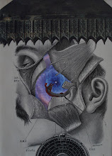
To which I added 4 elements:
But not before I painted the edges of each of the elements so that the "inner" white of the page did not "shine" from the edges of the elements. When you paint the edges first, it creates a much "flatter" and, more importantly, integrated composition:
And interestingly (at least I think), the "planet" was not really a planet image, but a cut out circular section of an image of a vintage bell. This was a serendipitous (and very fortunate) moment for me (and the composition). I've shown the cut here, replaced with a slight rotation (an idea for another composition?):
Then I made a slit along the edge of the finger on her left hand so that the black-and-white rose could be placed "into" her hand rather than being placed on top of it. It certainly gives it a more natural and integrated look:
Finally... all the minute experimentation with placement of the other flower and the two orbs so that the balance is JUST right (as well as the cropping with the mat. Viola! "Moonflower" 2015 (8" x 5"):


It's fascinating to have a glimpse into your process. Great image.
ReplyDelete