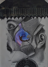
Quite serendipitously, I placed the negative space element over a beautiful violet-colored rose element... actually just about in the "correct" orientation. But what do I mean when I say "correct" orientation? Here are some possible orientations for the underlying flower element:


The different placements of the underlying floral element do not vary much in actual spatial terms (i.e., they vary by only millimeters). But the orientation relative to the facial/head outline created by the negative space is crucial methinks. So which one seems to "work best"? Here's what the finished piece looks like (unframed and framed) based one the orientation I thought worked best (btw, it took a significant amount of time to get it "just right"):


LOVE it. The purple looks like some sort of wrapping, rather than a rose.
ReplyDeleteYes... it's a cool effect, isn't it?
ReplyDelete