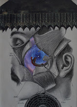
This piece (8" x 10") was made in honor of the 50th anniversary of the death of Kurt Seligmann. Instead of inclusion of an image of Seligmann or his work, I have chosen to allude to the artist through a combination of narrative and physical means. Not only was Seligmann a surrealist artist, he also wrote a book about the occult in 1948 entitled “The Mirror of Magic”. As part of my piece - which might be considered surrealistic in style - I have included a senryu (i.e., a haiku without reference to nature) that makes a conjecture about the connection of surrealism and the occult. In order to read the senryu, it must be seen in a mirror (provided); making this a subtly interactive piece. The senryu is "Surrealism, perhaps a mirror image of the occult world" (n. b. The title is ‘reflective’ of the year of Seligmann’s death).
Sunday, February 26, 2012
"Reflection 2691"
This piece (8" x 10") was made in honor of the 50th anniversary of the death of Kurt Seligmann. Instead of inclusion of an image of Seligmann or his work, I have chosen to allude to the artist through a combination of narrative and physical means. Not only was Seligmann a surrealist artist, he also wrote a book about the occult in 1948 entitled “The Mirror of Magic”. As part of my piece - which might be considered surrealistic in style - I have included a senryu (i.e., a haiku without reference to nature) that makes a conjecture about the connection of surrealism and the occult. In order to read the senryu, it must be seen in a mirror (provided); making this a subtly interactive piece. The senryu is "Surrealism, perhaps a mirror image of the occult world" (n. b. The title is ‘reflective’ of the year of Seligmann’s death).
Sunday, February 12, 2012
"The Question"
I finished this piece today. It was mostly finished for a while (the two holes with the man and woman). I knew I was going to put a third "hole" in it, but wasn't sure about what to do after that. I decided on the skeleton transfer. It's always a bit nerve-wracking for a collagist like me to place a transfer, because I never know exactly what it's going to look like until it is placed (and then it's too late to do something else). I like to have a little more control. But I think it turned out well. Then I thought I needed something in the upper left hand quadrant of the piece for "balance". I tried Saturn, but it was too dark (and thus not recessive enough). Then I looked at the piece matted and in its antique frame and I decided that although the piece isn't "balanced" per se, it "opens up" on the left and this actually enhances the "feel" of the piece. Glad to have this piece done (it's been around for a while) and happy to be fairly satisfied with it. BTW, it's 11.5" x 6". The question is... what is "The Question"? Enjoy.
Saturday, February 11, 2012
"Smoke 'em if you got 'em!"
Here's my latest piece (9.5 x 9.5"). I haven't been in the studio for a couple weeks because I have been busy with the beginning of a new semester and was at a conference in Louisville last week (that deserves its own post). Anyway, I'm pleased with this piece. In a way, it's the "opposite" of many of my other work in which I place color accents within a black-and-white (or muted palette). This piece features a colorful background with black-and-white accents. The "guys" were each individually cut and meticulously placed (that's what took the longest in this composition... by far). Enjoy!
Friday, January 27, 2012
a few shots from the opening at The Tech Garden
Sunday, January 22, 2012
Salon: Opening Reception: Thursday January 26th, 20125pm ...
Salon: Opening Reception: Thursday January 26th, 20125pm ...: Opening Reception: Thursday January 26th, 2012 5pm - 7pm The Tech Garden 235 Harrison St. Syracuse, NY Viewing hours: January 26th - Febru...
Saturday, January 21, 2012
detective
Marie Noelle-Little, one of my colleagues at Utica College, asked if I could use this magazine for my collages. I was SO excited to see it! I love the lighting! That's one of the things I "look for" when I am searching for images -- interesting and unusual lighting. The really nice thing about this image is that the light is coming so strongly from below. Of course the image itself is awesome too. I can't wait to see how this element gets incorporated into one of my works! Enjoy!
Saturday, January 14, 2012
blue and red pair
I posted the 'female' of this pair a while ago and just finished the 'male' last night. I had some left-over of the space/star element from the female, but as it turns out, it was a far lighter/bluer portion of the element and didn't "match". I wanted these tow pieces to be complementary. So I searched through my space/universe/galaxy books again and was extremely fortunate to find a page with what appeared to be the same image with the same varied colors. The stars were the same too. This is not common in that for many of these kinds of images, the stars are slightly different (i.e., more blurred or more "sparkly"). The red elements in these pieces are made up of the papers used for dress pattern cutting. I only had a couple swatches of this stuff. I LOVE the intensity of the color and the "random" textured pattern of the dots (created by that spur-like roller thing). I had Jim at Oskar's Framing do these beautiful metal frames and I like the way this pair turned out. It all started from my just playing around with some left-over elements. Once again, serendipity enhances the collage process! Enjoy!
Subscribe to:
Posts (Atom)