Wednesday, October 17, 2012

for fun


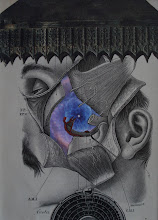
Here are a couple pieces I did "for fun" (i.e., again not putting too much pressure on myself to create a "masterpiece"). The owl piece I will give to a friend for Christmas. He has bought several of my pieces and I thought I'd give him a "freebie". He's an owl image/object collector; so he should like this one. The other piece I put together from some interesting elements I had lying around for a while. What's interesting is that my wife said that she liked it; but that it was a somewhat "predictable" kind of an image for me. I suppose it's been good for me to explore a little bit these days. Enjoy!

Tuesday, October 16, 2012

To The Power of N... again

Joel Lambeth has posted the latest artwork in the great Power of N project. Check out great works by prominent collagists at
http://www.tothepowerofn.joellambeth.com
Enjoy!

Tuesday, October 2, 2012

Why?


Why do I do the things I do? Well, I mean... of course I am referring to collage... and more specifically the compositions I create. This weekend I spent some quality time in my workspace and in my creative space. I was perusing some old magazines (always a good strategy for generating ideas and getting inspired). I came across one specific issue of LIFE magazine from the late 60s (1967, I believe) which included a picture of a Chinese civilian being beaten by a police officer. In the 1960s and 70s the imagery which could be found in popular press articles in magazines like LIFE and LOOK and TIME was sometimes quite graphic. I wonder how the recent wars in Iraq and Afghanistan would have been perceived differently if that were the case today. Anyway... I was drawn to this image as a potential collage element. Later on in the same issue I came across a full-page advertisement for Hunt's catsup. As some of you know, I really like images of cross-sections of tomatoes. The juxtaposition of the man being beaten with the tomato background I found compelling. Why? I really don't know. The image is certainly edgy (to say the least). In a way, I feel that it is a little Ray Johnson-y (and perhaps reminiscent of Warhol's "Disaster" series). As I was working with the composition, I realized that there are a couple of ways to crop the image. I originally thought that I would crop the text of the advertisement out of the composition. BUT, as it turns out, the text is really interesting in terms of an additional juxtapositional element. I really don't have ANYTHING against Hunt's catsup (or any other Hunt's product) and I would hate to inadvertently convey something negative about Hunt's (which might be inevitable to a viewer). I am leaning toward not "causing trouble" by leaving the text in as part of the composition. Of course then I start feeling uncomfortable that I am self-censoring (no good for an artist). I am posting both versions to illustrate my "dilemma". Believe me, I am fully aware that this composition is edgy on a number of levels... but this is what has been occupying my time this evening; and I thought someone might find the process interesting artistically (if not aesthetically). There's more to this story as well; and I will post more soon. Enjoy?

Saturday, September 29, 2012

relax 'n' scraps


I was back in the studio last night and had a great time (and was productive too)! Here's a small piece (3.5 x 4.5"), the size of which was dictated by a set of small frames I got cheap at a garage sale (or auction?). I'm feeling like I can have a little more fun with these pieces as I'm not spending so much money matting and framing. The small size affords me the opportunity to experiment with some scraps I have laying around. I had the cut woman as a scrap because she was the back of another piece I used. Looking at that piece in isolation suggests that it wouldn't be too useful. When I found another scrap consisting of an aerial view of farm fields, I immediately saw the similarity in shapes and tone of the two pieces. I really liked the combination of the two. But the composition needed some contrast. I looked over at my scissors area and saw the "polyester" element sitting there. "Why not?" I thought to myself. But then it needed some balance (and perhaps color contrast). I think the final muted mauve "punch outs" did the trick. I really like the final product... and it came from "nothing but scraps". I think this was a good exercise for me and got me out of thinking that every step of a collage needs to be something "special". Enjoy!

Sunday, September 23, 2012

Sculpture Space CHAIRity Auction 2012

Here's a short video clip of my piece being auctioned off at the annual CHAIRity Auction to benefit Sculpture Space www.sculpturespace.org Enjoy!

Thursday, September 6, 2012

black and white with "open" space


Here's a new one I "threw together" from some elements that I enjoyed. Again, I am trying to get back to a "make what I want" approach to my compositions instead of a "I gotta put together something impressive" approach. The former is what I had been doing for years and it seemed to be working. The "down-side" of experiencing some success in the art world I think is the transformation you go through from just "doing artwork" to "trying to do something". I hope that makes some sense as I have written it. Anyway, I had had a colored element added previously for contrast, but I rather like the monochromatic image better. I think it'll look great when it's framed too. I think I will entitle this one "Score!". Enjoy!

Tuesday, September 4, 2012

Creativity class

I'm writing this post to you from the sunny environs of my creativity class to show my students how to do a new post. Enjoy!