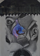
I have always thought that titling an artwork is an important part of the creative process. That's why I never use "Untitled" for my works. I understand why an artist might not want to "bias" a viewer and why they might want the viewer to "title" the piece they are looking at. I just happen to disagree with that approach. Perhaps at the opposite end of the spectrum, I recently created two pieces for which I think the title played an integral role in the overall composition of the artwork. One was the piece I posted in the previous post. Since it is a pretty good bet, that most viewers would perceive the element on the lower left as including something phallic, I thought it would funny to "call out" the viewer with the title, "Hey, It's You Who's Making it Sexual". My hope is that the title will elicit a smile from the viewer. I created the piece shown below, a couple nights ago. After experimenting with various elements, I found this combination to be quite compelling visually. The patina of the vase (an element from 1870s!) matches quite nicely with the coloration of the lunar surface. The embracing sculpture echoes the handles of the vase quite nicely too. But then I was left with the text in the image (which, as a regular blog viewer would know, is something that is not typically found in my compositions). How do those words relate to the overall composition? How do they "fit"? Well, they really don't. Should they just be considered superfluous, but interesting? I wasn't sure how I would consider them. Then, it hit me. I thought it would be funny to think about it as alluding to the not uncommon experience of being in a relationship with someone who might say something strange in an intimate moment, and then you're thinking "What the hell does that mean!?". So I entitled this piece, "Charles Didn't Know What to Make of What She Said". In this case, the collage, in a way, is not really complete without the viewer experiencing the title (i.e., the piece cannot be fully appreciated with the title). Again, my hope is that the title will not only "illuminate" the piece, but also elicit a smile from the viewer.
Thursday, March 28, 2024
Saturday, March 23, 2024
Last two pieces
Okay, now I can relax a little bit (although I still have to make sure matting and framing is complete). I finished the last two pieces for my upcoming exhibit on this snowy afternoon. One of these is entitled, "Maybe a Little Music Will Help"; the other is entitled, "Hey, It's You That's Making It Sexual".
Thursday, March 21, 2024
"Calibrate"
This is probably my penultimate new piece for my solo exhibit in April (7" x 7", 11' x 11" framed). Looks like 5 elements... but it's only 4.
Sunday, March 17, 2024
Teeth
In addition to the solo exhibit I have coming up in April at The Other Side, I am also part of a 3-person "collaborative" show at Kirkland Arts Center in September (with Anthony Morgan and Tony Thompson). I am going to deliver this "base" collage tomorrow, for Tony Thompson to paint on/over. I'm looking forward to what emerges!
Saturday, March 16, 2024
pre solo exhibit stress
I am very excited for my upcoming solo exhibit at The Other Side gallery in Utica, NY! I have been creating fairly steadily over the past year or so, and I'm very happy to be able to show my artwork as a collective group (rather than just a single piece here and there). But I am also feeling a bit stressed about it. I've had previous solo exhibits with far less stress. Part of the stress is coming from the fact that I would like to have two more pieces made for the show (which opens on April 5th!); and I would like to make them a little larger. Anyone who has followed my work on this blog knows that my work tends to be small format. In fact, I think my favorite size is a 7" x 7" composition in an 11" x 11" frame. I will have a number of these in the upcoming exhibit. But, of course, works of this size tends to "shrink" on a gallery wall. In addition, I have been wanting to push myself to increase the size of my works -- partly because I have LOTS of larger frames that have accumulated in my studio as a result of acquiring them at garage sales, auctions, and at the side of the street. Larger pieces would require me to explore "mosaic" collage techniques a little more (something I did earlier in my collage career). I like the challenge of that. I enjoy thinking about all of this. However, as most creative folks (artists, musicians, etc.) are well aware, being "stressed out" about anything is not conducive to the flow of creative process. I have also been stressing out a little bit because I have a collaborative work in progress for which I had several "perfect" border elements identified that I had somehow misplaced in my studio. SO... I spent lots of time in the studio over the last couple days, cleaning and organizing (yes, I tend to do that often, because I have SO MUCH stuff in my studio area). Here's the good news. I found the border elements! That was a big stress-reducer. I also went through a ton of beautiful elements that I had collected (and filed) over the years. So I have some good inspiration for potential compositions. I have also cleared significantly more space to work. Things had been getting a little too "claustrophobic" recently, which was impeding possibilities. I have a renewed excitement and optimism as I write this blog today. I look forward to being in the studio for the next week! And, BTW, I did something else to relieve my "stressed" state-of-mind yesterday (and I think it's good "advice" for others). I simply allowed myself to create something comfortable and enjoyable (tried to forget about having to do it). This image is of a "sketch" I did last night. Yes, it's a classic "Specht"(depth, contrast, and space)... and I like it. An interesting technical aspect of this piece, is the fact that I cut out a character from the background, black-and-white element, and brought it into the foreground. The big benefits of this, is that the gray scale is identical to the background; and the size and position remain congruent with the background. Still needs some minor cutting and finishing work, and I'm not sure if I will keep the star element in (that has gotten very cliche for me), but will finish the piece today and include it in the exhibit. I think folks will like it.
Sunday, March 10, 2024
Fun stimuli
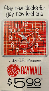
My focus last night in the studio was cleaning and re-organizing (once again), rather than creative production. So it's that time again, to share some of the entertaining pages from 1950s magazine pages...
Monday, March 4, 2024
Sunday piece
I had the wonderful opportunity to spend the entire day in my studio yesterday. Dedicated time... yes! I was able to see this piece to completion. It includes the subtlest of transfer elements. I've entitled it "I know you can identify me... but can you detect the sadness"? It's 6" x 6".


