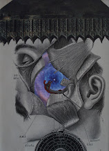
Here is the finished piece (11" x 14"; 16" x 20" framed)...
Sunday, December 29, 2024
And to Dust You Shall Return
Friday, December 27, 2024
Video about emergence of collage
Hmmm... I searched and was unable to find a post where I shared this video (although there is a long text about it back in 2022... when the piece was made). I think this video is instructive/helpful for those thinking about how composition emerge. So, I will post now.
Monday, December 23, 2024
Transfer update
Well, I am pretty pleased with how the chemical structure transfers ended-up; BUT, the human body transfer images are getting lost a bit on the cratered lunar surface -- I think because the lines were not "thick" enough (too little "weight"). And as I am completing the finished work (which is larger than usual), I'm finding that the lines aren't really visible in photos of the work (I will share the completed image probably tomorrow), but can be seen when viewing the composition live. The subtly is compelling, I think; but it will be difficult to submit a photo for exhibit consideration.
Saturday, December 21, 2024
Transfer considerations
So, I won't bore you with completed collages of the sketches I posted previously (although there will be a "dump" coming soon). But, I wanted to comment a little on a technical aspect of an up-coming piece, involving transfers. I'm excited about putting some chemical structure transfers on the piece. When using such a transfer, however, you should keep in mind that the transfers typically come out in reverse -- so if there are "C"s (for carbon), or "S"s (sulphur) or "P"s (phosphorous) in the chemical structure, the letters will be backward. So I perused pages of chemical structures to find ones with "O"s (oxygen) and "H"s only (although I think "N"s (nitrogen) would be 'pull-off-able'). I also found a couple that had "C"s, but that could be trimmed to omit them. Anyway, here are some example pages of what I was looking through...
Wednesday, December 11, 2024
saturated blue
After using the saturated blue galactic element in the collab piece I shared in the last post, I'm doing some exploring/experimenting with the leftovers (and additional) pieces -- there were several pages from an astronomy book I had. I'm really liking the color and saturation and the curvature; and they are complementing some other saturated elements that I have in the studio. None of these compositions have been "put down" (adhered to the substrate), but I suspect something permanent will come out of these explorations. I am in finals week at school this week; so I will soon have more time to spend in the studio -- with collage, or on my guitar!
Saturday, December 7, 2024
Collab piece with Eric Whitfield
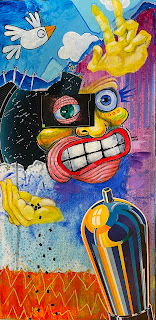
I'm SO excited about this collaborative effort with painter Eric Whitfield. Here are the before and after photos of the piece...
Saturday, November 30, 2024
ART EXPO 2024
I had a great time at 4 Elements Studio (Utica, NY) ART EXPO yesterday! It's always so refreshing to spend time with such awesome and talented folks. For any visitors who scanned my QR code, thank you for your interest and support! I expect that I will get even more involved with the arts community when I retire.
Friday, November 29, 2024
Thoughtsgiving 2024!
In 2010, a couple of friends of mine started a "new holiday" at our local watering hole (The Green Onion; Utica, NY). We called it "Thoughtsgiving". I have posted about this several times in posts on this blog. Like many other things, the COVID years put a damper on public events like Thoughtsgiving. One of the traditions of Thoughtsgiving was that I made small lapel pin collages. Folks were asking me about Thoughtsgiving this year, and I was very much motivated to make another set of Thoughtsgiving lapel pins. But, as they say, the raod to hell is paved with good intentions. Between getting two conference abstract submitted the week before Thanksgiving, and needing to get artwork done for today's ART EXPO at 4 Elements Studio, I "ran out of time" to make a dozen collage pins. When my friend and fellow Thoughtsgiving reveler asked if she could make crocheted lapel pins for the holiday, I said "absolutely!". And she not only did that; but she also composed and read to the folks at the bar, a beautiful and heart-felt "Letter to The Green Onion Family" -- which I think captures what a number of us feel about the establishment and the souls that make-up "the regulars". Thanks Maisie! I think Thoughtsgiving has been "officially" revived! See all y'all at next year's Thoughtgiving!
Sunday, November 24, 2024
Another collaboration project (this time with Eric Whitfield
Eric Whitfield is an artist from the Utica area with whom I've recently been introduced. He creates these kinds of crazy, and well-executed animated characters; and also does more abstract works that are also well-executed. When he posted this piece recently on FaceBook, I contacted him immediately to ask whether he would be interested in me adding collage elements, as a collaborative work. He was not only interested, but excited to do it. I'm pretty jazzed up about it too! Now I hope that I can do the piece justice. So, here's the "before" image (already a great piece, imho).
Saturday, November 23, 2024
Production day!
I feel very accomplished today. I finished three new pieces for the upcoming Art Expo at 4 Elements Studio (Black Friday). I think I had a little 'beauty and the beast' thing going on with the transfer flower piece, compared to the weird skull piece. I had to add an additional pansy to the flower piece, because that corner was too "empty", if I left it out. It balances the composition better, but maybe I should have used a different frame. I like the rustic feel of the frame I used, though. The one with the gold frame is actually three-dimensional with a small box affixed with additional collage elements.
Friday, November 22, 2024
Transfers can be tricky
As most collagists know, transfers can be tricky. Positioning is perhaps the trickiest part (with incomplete "erasure" of paper, and ghosting a concern too). Last night, with a little skill and a little luck (gotta have some luck), I was able to accomplish one of my best transfers ever. I was trying to get the skull part of this element to line up with the yellow petals of the pansy. I was successful with that goal. I didn't realize the flower petal was going to look so good as a "brain" within the cranium. And I was "rewarded" (luck!) with some very nice additional alignments. One part of the underlying element ended-up looking like a heart; and other parts lined-up beautifully with aspects of the skeleton. I'm pretty excited about the way this came together, and will probably not do anything more -- I don't think it needs anything more. A beautiful two-element transfer collage.
Tuesday, November 12, 2024
busy sketching
I haven't posted in a while, but I have been busy in the studio. My time lately has been spent looking through magazines for interesting elements and doing some sketching (exploration and experimentation). I have one piece that is nearing completion, and several pieces which are still "emerging". Here are a few of the works in progress (which may or may not end-up ultimately being created and "put done" on the substrate).
Wednesday, October 2, 2024
Two elements
Sunday, September 22, 2024
Subliminal influence?
Here's another experimental sketch I worked on this week. I had a bunch of interesting green elements leftover from a number of previous projects. I thought I would just try something a little different, for me -- more abstract than surreal or narrative. I really like the different greens together. And I always like a slash of contrast (the red, in this case). Interestingly, when I got into my office the following day, I was struck by the similarity between my sketch and the cover of the textbook I use for my statistics class (I will provide the name of the cover art artist as a edit to this post). I had no intention of trying to emulate the cover of my stats book with the sketch. And I am not even convince that it influenced me explicitly. But maybe deep-down in my subconscious, the image influenced my sketch. Or perhaps, it was a "great minds think alike" kind of a thing (although I would consider it more of a "artists think alike" phenomenon). It does raise an interesting issue regarding the influence of a lifetime of exposure to visual stimuli. Do all of these experiences get "stored" somewhere in memory? Do all of these experiences have the potential to influence artistic exploration and production? I think that perhaps more likely, is that the total accumulation of life sensorial experiences help shape our potential to create new, integrative, synthetic compositions/images. This "coincidence" I found particularly noteworthy.
Saturday, September 21, 2024
new sketch
I have been working on finishing-up some sketches (i.e., completing the composition) and on some new sketches. Here's a new one from last night. The saturated colors in this vintage artwork of a motor I find quite compelling. I think the sculptural elements fits well (I need to do more micro-cutting, of course). What I am "struggling with", at this point, is what to do with the textual part of the background element. If I leave it as it is, I think the balance of the overall composition will need some work (i.e., adding other small elements)... I think. I was also contemplating leaving the overall composition a bit "unbalanced" to create interest/tension (i.e., "does a composition always need to be 'balance'"?). I could also obscure the writing/text with another element. The element shown here is certainly too big; it is just an example. Of course, that creates its own balance issues for the overall composition. I will continue to enjoy experimenting with elements and the overall composition, and of course, will eventually post the finished piece.


