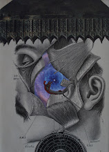
Here's a piece I finished yesterday. It is a two-element piece with a substrate (the little boy's photo) covered with a transferred image of an anatomical image of a breast with surrounding musculature and blood vessels. I wasn't sure how the transfer would turn-out, given that it involved much more than a simple line drawing (like other transferred images I have done in the past); that is. this image had lots of gray areas representing the musculature. I also had to be very careful with the placement. I wanted the anatomical nipple to be precisely over the boy's left eye. If you are familiar with transfer, this was particularly challenging because you have to be able to see "through" the paper (and the substrate of the boy's photo). I was able to accomplish this with the large cone lights in my studio. Then I realized that, in order for the image to look like it was "on" the boy's face, I needed to trim the transfer image to conform with the face (another step that required looking at the papers through a bright light course. I am VERY pleased with how this transferred image turned-out; and I am VERY pleased with the collage itself (the way some of the contours of the transferred image integrate with the boy's face fit so well and were basically serendipitous). This two-element collage reminds me of some of the work of one of my favorite collage artists -- John Stezaker.
Friday, June 14, 2019
Subscribe to:
Comments (Atom)


