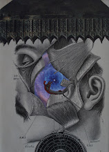
My wife (Mary Carol)'s birthday was August 15th and somewhat coincided with our totality trip to Kentucky; so her birthday collage-card had a theme this year...
Sunday, August 27, 2017
"Finding your center"
Here is the finished product from my collaborative piece with friend and fellow Utica-area artist Tony Thompson. It is entitled "Finding your center". I have shown details here of how I included these letters and words into the falling tears. The diagonal half of a face was actually a "throw away" portion of some elements I used for my wife's recent birthday card. Not only did it seem to work well here; but serendipitously, part of one of the flowers in toward the center of the bunch provides an eye-like complement to the face. This was all unplanned initially; but speaks to the necessity of paying close attention to details as one explores a element placement within a composition. It also speaks to the fact that in collage, sometimes "throwaways" are really throwaways. A collagist must always pay attention and capitalize on serendipity!
Monday, August 14, 2017
Another collaborative project with Tony Thompson
VERY excited to have gotten my "canvas" from my friend and fellow artist Tony Thompson today. We are doing another collaborative piece. For the first one we did, Tony painted on a collage I had done. For this one, I will collage on this painting that Tony has done (although I like it just the way it is). Looking forward to experimenting and, hopefully enhancing this piece!
another (3rd) Kolaj article
I am so pleased to say that I have just had my third article published in Kolaj magazine entitled "Affinity for the Infinity". The folks at Kolaj did a great job with the layout (which includes three of my collages and two of my friend and fellow collagist Anthony Morgan). If you're not already a subscriber to this publication, I would HIGHLY recommend it.
sketches
Here are a couple sketches I completed this week. The hand piece still needs some detail work done. I posted this sketch on Facebook and people are REALLY responding positively to it (a couple folks are offering to buy it). I had a feeling that it would be popular. My initial plan was to use the anatomical details of the hand and place different backgrounds behind it (I still may do this) as part of a series I am working on for a conference presentation (more on that later). But because people have been responding so positively, my temptation is to simply finish it up and frame it. The piece with the vintage etching of the woman reading is a work-in-progress (not quite wowed by it yet, in my own mind's eye).
Subscribe to:
Comments (Atom)


