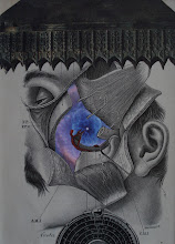
Well... here is the last piece from 2016. I really don't think the photos do justice to this piece. It is framed in a 15.5" x 15.5" metallic frame which really complements the composition well. I wash;t as active as I had wanted to be during the second half of 2016, but I've had a nice run over the last couple weeks, which I think will continue over into 2017. For some reason, I feel re-energized about my creative work and am looking forward to see what emerges from my efforts. Let's say good-bye to 2016 and hope for the best for 2017. Happy New Year one and all!
Saturday, December 31, 2016
Friday, December 30, 2016
Another cropping lesson
After all, I am a teacher at heart. Here are three versions of a collage which vary slightly only in terms of where they are cropped. Notice especially the placement of the light sconces and the girls are. In my mind, the lights MUST be included; AND the girls left arm must be part of the composition as well (that is, for the most "pleasing" composition). Perhaps you would choose another of the three options.
Thursday, December 29, 2016
Wednesday, December 21, 2016
Art imitates life imitates art imitates life
A couple years ago, I gave my friend and fellow artist, Anthony Morgan, a collage inspired by Kurt Vonnegut's "Slaughterhouse 5". He placed it prominently in the Black Gryphon, a restaurant that he owns in Elizabethtown, Pennsylvania. This week, a fire broke out at the restaurant. Although fortunately no one was hurt, a variety of artworks were lost in the fire and heat and smoke (including artwork of Donna Durr, St. Bradford Brooks, and Anthony Morgan). Here is the residue that was left of my collage. Ironic that a Slaughterhouse 5 collage was destroyed in a fire. So it goes...
Wednesday, December 14, 2016
Sci-Fi-themed exhibit
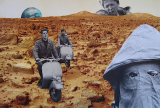
My friend Steve Nyland is curating an upcoming exhibit in Syracuse, NY with the theme loosely based on a vintage Sci-Fi magazine theme. I'm excited to be thinking about creating collages to fit the theme. The theme certainly speaks to my voice (pun intended). Here are two pieces "in progress" (the "Het!" piece is close to being finished).
Saturday, December 3, 2016
post hiatus
To Whomever Reads this Post,
Once again, I have taken a hiatus recently from posting. If you are one of my followers, I apologize for that. I have been actively involved with pursuing some of my academic/scholarly interests (including my research on nostalgia and grief). I have also been somewhat involved in campus politics again, and that has kept me busy. In addition, the American election of our new President has been...well, more than a little disappointing; and certainly did not contribute to a positive or creative outlook on life. But alas, I am starting to get back into the creative mode and have spent some time in my studio recently. I expect to be spending more time there in the upcoming weeks as well (with a much desired and deserved break from classes). I have some exciting personal art news to share as well, but will do that in a future post.
I went to see the Steve McCurry exhibit here in Utica, NY at the Munson-Williams Proctor Art Institute. I also saw him speak. Both exhibition and talk were REALLY great. The "Afghan Girl" photograph was PHENOMENAL in-person! The reproductions (including the one on the cover of National Geographic in 1985) do not do the photograph justice. Perhaps these latest pieces were subconsciously inspired by McCurry's photography (although his are extremely colorful).
I have always been intrigued by the multitude of variations of blacks and whites when it comes to photographic reproductions which can be found in magazines. Recently I have been interested in using these variations in collage compositions. And of course, I have often used human faces within my compositions as well. The pieces I present here are not meant to be "pretty" (i.e., or necessarily aesthetically-pleasing... although I hope they are in their own ways). I do hope, however, that they are "evocative". At some level, I believe that evocation is the essence of "good" art. The image should evoke emotion... any emotion. Art should also provoke. I hope that these images provoke thoughts.
It feels good to be posting again on monkeybrain! I sincerely thank you for your interest...

Tuesday, September 20, 2016
Sculpture Space, Inc. CHAIRity Auction
I have decided to donate this piece for the annual CHAIRity auction at Sculpture Space... an international sculpture residency program with which I have been involved since 1999. Hoping it will fetch some good bidding next Saturday night.
Thursday, September 8, 2016
"Antidote"
Friend and fellow collagist Anthony Morgan and I had our opening reception last night for our two-person exhibit we entitled "Antidote". We decided to call it that because we hope that our artwork (and artwork in general) provides people with an antidote, even if only temporary, to the myriad of woes in the world. The opening reception was a success! Lots of friends came out and some of the pieces sold (which is always a nice bonus). Toeny and I created this piece to raffle-off (I hated to see it go ;-)


Sunday, September 4, 2016
finished product
I know I should wait until I have the finished product, but I'm just so excited about this one, that I had to post the "almost-finished" composition (and the frame goes perfectly too). For now...
Saturday, September 3, 2016
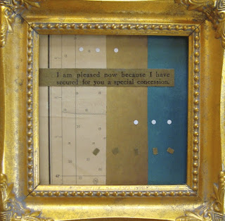
"I'm pleased now"
I've been working on new pieces for my show next week at The Dev in Utica, NY. I was hoping to work on some bigger pieces (dimensionally), but find myself drawn more to creating smaller pieces. Here's one that's 4.5" x 4.5". And this one is a bit less "narrative" than usual for my work. I was just attracted to the colors and patina of these pieces of paper (and of course, couldn't resist the text).
Tuesday, August 23, 2016
Collaborative with Tony Thompson
I am so glad that my artist friend Tony Thompson agreed to do a collaborative piece based on a previous collage that I did in 2013. Here is the original collage (which I was never too pleased with), and the piece as enhanced with Tony's painting! I love it!
Sunday, August 7, 2016
another finished piece
So... last month when I was at the reception at Kirkland Art Center (in Clinton, NY), my friend and fellow artist Steve Nyland (please check out his blog; listed on my blogsites) informed me that I would be having a show next month at The Dev (in Utica, NY). He said "It's a tradition". Granted, I had show there for the last two Septembers. But I didn't want to be presumptuous. I am excited to be showing there again with my fellow collagist Anthony Morgan! And it's just what I needed to get me "finishing" some pieces that have been lingering in my studio, half-done. I posted a sketch of this piece on this blog back on April 30th (wow! I thought it was just a couple weeks ago). I needed to get it finished, because I want to show it (and because my friend and fellow creative spirit Gabe Lockwood encouraged me, because he loved the unfinished piece so much). So, here it is in its final form (I found the perfect space background... for which Toeny will bust my chops)...
Saturday, August 6, 2016
finished product!
I didn't think I was going to finish this piece today; but alas, it happened! Pretty pleased with the way it turned out. Mary Carol will receive it for her birthday when we are in Stockholm!
art deco frame
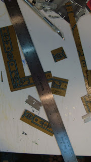
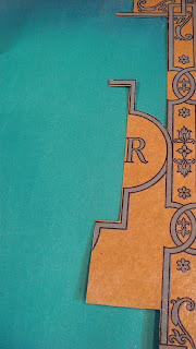
I decided to post this "work in progress" because I am excited about it. I have also, once again, taken some intermediate photographs and thought some of you who follow this blog might appreciate "seeing the process" again. I got this beautiful vintage "art deco" frame at the Farmersville auction (in Lancaster, PA). The dimensions for the art is only 3.5" x 10.5". The book cover that I am showing here was also procured at the auction. I love the patina and the design; so I wanted to match it up with the frame. Unfortunately, the book cover was a little bit short in the length dimension; so I needed to do some cutting to make "extensions". I also decided to cut out some of the design "lines". It seems to be coming together, but I still have work to do (including painting the edges of the "lines"). You can begin to see what the finished product will look like (with the flowers and the green background). I need to get this piece finished this week, before we head out on our Scandanavian cruise; as this will be a birthday present for my wife (I also hope she doesn't look at this blog before we go ;-)
Thursday, August 4, 2016
"Night Swimming"
This is a piece I finished last night. I have tentatively entitled it "Night Swimming" (with deliberate allusion to the R.E.M. song). Oftentimes when I am in the throes of creative activity, I am not in the "mode" of documenting the actual process photographically. In the case of this piece, however, I was able to make photos of some of the intermediate steps. I think that I was compelled to do this by virtue of how the piece "emerged". I was working on another, bigger piece and had cut out a portion of that background element (shown below with the dog). I hadn't planned to do anything with that cut-out (i.e., I had presumed it would be a throw away piece). I even ripped off a small portion of the throw-away piece. Then, for some reason, I looked at it as a potential substrate. I was particularly drawn to the color of the ripped portion and the dried-up crackly glue that had been left behind from when I took the old mat off. I started "sketching" with some other elements that were laying around the studio and it started to "speak" to me. I even ended-up using both a new mat and an old mat with its yellowed edge. I'm really enjoying this piece and I think, in a way, it serves as a good example of how the creative process often works and, in fact, how eventual "success" is often not predictable in a linear fashion. I am so happy that I have some photographic record of how this piece came together. I may use it in my teaching.
Monday, July 25, 2016
titles
If you have any history reading this blog, you are well aware of the fact that I certainly love playing with titles of pieces (as Jo Murray recently acknowledged). In fact, as I have mentioned before in this blog, I think titles are integral parts of a piece of art... they're part of the "collage" of collage. In this spirit, I enjoyed entitling this piece. This one is a bit of a different composition style for me... I was experimenting a little tonight. The title of this piece is "Her Stories During Family Night Often Reminded Him of When He Was a Young Girl". For those readers who may not have English as their first language, I will assure you that you have read that title correctly. It's a funky play on words and images... it's part of the "collage" of thoughts. I hope you enjoy it (even in its weirdness). By the way, this photo is not the finished work (I have done some touch-ups and will add a final piece tomorrow).
Wednesday, July 20, 2016
motivation
I found out last week that I will be exhibiting this September at a place in Utica, NY called The Dev. The curator - Steve Nyland - said that "it's a tradition"! That's cool. I have shown the past two Septembers there; but wasn't assuming that I would be this year. Anyway, I'm excited about it! The Dev is a bar/music venue/art gallery. They do a great job at all three and attract many of the young "arterrati" in Utica. Being informed that I have an up-coming exhibit is just the kick-in-the-ass I needed to get me creating (instead of cleaning and organizing forever). Of course, the cleaning and organizing has helped me with the creative process as well. I'm heading to Copenhagen, Helsinki, and St. Petersburg in August for 10 days; so I'm actually feeling a little pressure to get pieces cranked out (without compromising on quality, of course). I could show pieces I have already made; but I like trying to create as many new pieces for exhibits as I can. I also have a somewhat interested following of my work in the Utica area, so I want to show them new work. Here are a couple I completed today. One is entitled "Her Name Rhymed with a Part of the Human Body". The other is entitled "The Sabine Family Scrabble Game Got WAY Out of Control".
Sunday, July 10, 2016
guitar followup
Okay, here is the finished front. Now on to the sides; which will be more technically challenging given the curves.
Saturday, July 9, 2016
Guitar collage
I sanded and coated this guitar about a year ago and there it sat in my studio, staring at me. A bit intimidating to start it (even though the guitar only cost me $50). So I "dove in" with the Eiffel Tower element. I had that element for a little while and LOVE it; and wasn't sure I wanted to use it on the guitar. BUT, I LOVED the way it looked on the guitar. Then what? Lots of experimentation with placement of various elements. I didn't want the guitar to look too "messy". I needed larger elements with interesting color and design. The guitar is acoustic, but has built-in electric pick-ups; so I'm not too concerned about how the colaging will affect the sound. I'm pretty satisfied with how it is coming along so far.
Subscribe to:
Comments (Atom)


