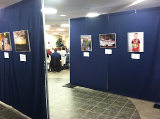
Wow! I went to a small photography exhibit this evening at Utica College which brought tears to my eyes. This exhibit should be up for an extended time so that more folks could experience it... really. So here's the deal. My friend and colleague Linnea Franits is a faculty member of the Occupational Therapy program at Utica College. She worked with a group of OT Masters students on a project for which each student provided a camera to an individual who had "life compromises" (my terminology, not hers). Each individual was asked to take photographs which represented how their life had changed since their "compromise". Some of the individuals had cancer, some had children with cancer, some had been in prison. Linnea selected representative photographs and associated quotations for the exhibit. Here are some shots from this evening. Some words to describe this exhibit: "powerful", "touching", "human", "inspiring". One of the most powerful was a photograph taken by a mutual friend of ours -- Lisa Davis -- who died this past semester after a LONG and courageous battle with cancer. Thank you Linnea Franits, for keeping the humanity in academics. Bravo to you and your students on a great show! Again, this exhibit needs to be seen by a wider audience.
Tuesday, May 28, 2013
Sunday, May 26, 2013
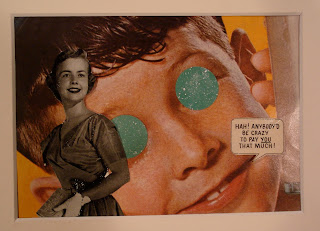
"Apophenia"
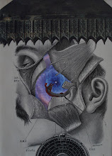
I'm very pleased with having finished my submission for the annual "Wish You Were Here" postcard exhibition of the National Collage Society (the bluish lunar one). It's entitled "Apophenia" (as a teacher, I'll let you look-up what that means). I had been focused on a totally different type of piece ("experimental" elements shown below
). It wasn't until I had the negative space of the head and torn name and address scrap that I started playing with another idea. And it all came together within an hour too. It amazes me how this creativity stuff works sometimes!
). It wasn't until I had the negative space of the head and torn name and address scrap that I started playing with another idea. And it all came together within an hour too. It amazes me how this creativity stuff works sometimes!
mini-collage lapel pins
Hadn't planned on making these today; but I was cleaning/organizing my workspace and started one of these with some scraps. They're fun to put together, so I decided to finish the strip of watercolor paper I had prepared.
Saturday, May 25, 2013
another small for today
Here's one that I put together fairly quickly last night. I love variations of gray with color contrast "offset" elements. This one is 5"x 4".
New piece
This one is called "The Previous Generation (before The Invasion)" and is 5" x 7". The background for this piece had been sitting around my studio for about a year. I'm glad that I finally put it to use.
The Artist Catalogue
For those of you who haven't seen this; I'm VERY excited to be one of the twelve artists featured in the Summer 2013 issue. It includes artwork, an artist's statement and a short interview. Enjoy! www.theartistcatalogue.com
Friday, May 24, 2013
"sketches" in collage
If you have been following my posts at all lately, you know that I have been doing LOTS of experimenting with images (I eventually hope to start cranking out finished pieces ;-). In a way, I suppose this is analogous to a painter doing sketches before executing "the real thing". I absolutely enjoy manipulating interesting images for possible collages. I thought I would share a particular collage "sketching" strategy/process. I came across this image in a 1893 volume of The Illustrated London News. What a beautiful engraving! For collage purposes, I was particularly struck by the 3-D effect seen in the horse at the center of the composition. I'm still not sure what I am going to do with this element. At first I thought I might use it as a background; but I was also considering "extracting" the horse as a foreground element. Remember, I am an analog collagist and self-impose the restriction that I will not use photocopies of images (or digital manipulation) in my collages. So I only have the original to "work with". I decided to make a couple of photocopies of this image and do some "sketching" with the photocopies. I show here the original and the "extracted" image. Then I did some experimenting with placement on a couple of interesting backgrounds. I'm still not sure how I will use this image; but I wanted to share with anyone who might be interested, how this collagist works with collage "sketching". BTW, I don't use this particular photocopying strategy often; but with an image like this one, it works well.
Wednesday, May 22, 2013
more experimenting
I've been enjoying a day totally free of responsibility today. It took me a while to get motivated to do anything ;-)... but I did some experimenting with images this evening. I'm really looking forward to what will come to be this year's entry into the annual "Wish You Were Here" postcard show of the National Collage Society (limited to 4" x 6"). Here are the results of some of my playing around today...
Photography exhibit at Utica College
For anyone reading this post in the central New York area, there will be an interesting photography exhibit next Tuesday, May 28th in the Utica College Library Concourse by Utica College students, under the direction of Professor Linnea Franits. Here's her description of the project:
"In the fall of 2012, a group of Occupational Therapy graduate students handed out cameras to people with the goal of finding out more about how certain circumstances have impacted their lives. They gave each photographer a simple prompt such as ‘Take pictures of how your life has changed since your diagnosis of cancer’ and encouraged them to interpret this freely. The photographs that those individuals took and the stories they told about them gave the students a deeper understanding of how life events can deprive or enrich our own narratives."
"In the fall of 2012, a group of Occupational Therapy graduate students handed out cameras to people with the goal of finding out more about how certain circumstances have impacted their lives. They gave each photographer a simple prompt such as ‘Take pictures of how your life has changed since your diagnosis of cancer’ and encouraged them to interpret this freely. The photographs that those individuals took and the stories they told about them gave the students a deeper understanding of how life events can deprive or enrich our own narratives."
Monday, May 20, 2013
playing around
Here are some images of potential composition ideas as I was playing around with the Ovaltine image. For those of you who know my work, you'll notice that these images are a bit different (although with my "voice" still present). I decided the other night to just try some things out. I want to be less rigid and I think it's good to just try new things. I hope you enjoy!
Saturday, May 18, 2013
cropping
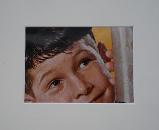
Now that my classes are over for a while, I am hoping to do a little more artwork. In addition, I am hoping to do a bit more posting on this site. But of course, even though classes are over, there's always time for learning! Afterall, I am an educator. I thought I would focus on "cropping" for this post. Last night I came across this nostalgic image from an Ovaltine advertisement.
I will likely use this image in an upcoming work. One of the first things I do is to crop the image in various ways to "discover" the best cropped image to work from. Here are some possibilities:
As you can see, each one has its own character; with the focus on various components of the image. I will probably "go with" the first cropping as it balances the yellow backgrounds (both in terms of position in the image and in shape). So many possibilities. In a way it reminds me of the cropped photography work of Richard Prince. What do you think?
Wednesday, May 15, 2013
simple pleasures
I suppose a collage can't get much simpler than this one. It's 2.75" x 2.75" and is comprised of only two elements. But I am enjoying it nonetheless. I've always been a sucker for color contrast on black-and-white (and vice versa). And I really am drawn to the imagery and cropping of this piece. Hope you enjoy it too!
Tuesday, May 14, 2013
"Esther" accepted!
I am very excited to announce that "Esther" was accepted and will be the cover art of the upcoming issue of the scientific journal "Learning & Memory". See the other artwork for previous issues at http://learnmem.cshlp.org/
Thursday, May 9, 2013
"Esther"
I finished this piece this morning... which is a good thing as it is "due" tomorrow. It was made for Dr. Robert C. Twining and will hopefully make it to the cover of the journal "Learning & Memory". Mariani Wine was a concoction of wine and cocaine from the late 19th century. The molecule that I transferred on is 17-beta estradiol. Bob's research - which will be published in the journal - examined the effects of estradiol on cocaine self-administration in rats. Enjoy!
Subscribe to:
Comments (Atom)


