Wednesday, October 17, 2012
for fun
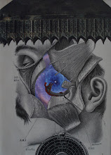
Here are a couple pieces I did "for fun" (i.e., again not putting too much pressure on myself to create a "masterpiece"). The owl piece I will give to a friend for Christmas. He has bought several of my pieces and I thought I'd give him a "freebie". He's an owl image/object collector; so he should like this one. The other piece I put together from some interesting elements I had lying around for a while. What's interesting is that my wife said that she liked it; but that it was a somewhat "predictable" kind of an image for me. I suppose it's been good for me to explore a little bit these days. Enjoy!
Tuesday, October 16, 2012
To The Power of N... again
Joel Lambeth has posted the latest artwork in the great Power of N project. Check out great works by prominent collagists at
http://www.tothepowerofn.joellambeth.com
Enjoy!
http://www.tothepowerofn.joellambeth.com
Enjoy!
Tuesday, October 2, 2012
Why?
Why do I do the things I do? Well, I mean... of course I am referring to collage... and more specifically the compositions I create. This weekend I spent some quality time in my workspace and in my creative space. I was perusing some old magazines (always a good strategy for generating ideas and getting inspired). I came across one specific issue of LIFE magazine from the late 60s (1967, I believe) which included a picture of a Chinese civilian being beaten by a police officer. In the 1960s and 70s the imagery which could be found in popular press articles in magazines like LIFE and LOOK and TIME was sometimes quite graphic. I wonder how the recent wars in Iraq and Afghanistan would have been perceived differently if that were the case today. Anyway... I was drawn to this image as a potential collage element. Later on in the same issue I came across a full-page advertisement for Hunt's catsup. As some of you know, I really like images of cross-sections of tomatoes. The juxtaposition of the man being beaten with the tomato background I found compelling. Why? I really don't know. The image is certainly edgy (to say the least). In a way, I feel that it is a little Ray Johnson-y (and perhaps reminiscent of Warhol's "Disaster" series). As I was working with the composition, I realized that there are a couple of ways to crop the image. I originally thought that I would crop the text of the advertisement out of the composition. BUT, as it turns out, the text is really interesting in terms of an additional juxtapositional element. I really don't have ANYTHING against Hunt's catsup (or any other Hunt's product) and I would hate to inadvertently convey something negative about Hunt's (which might be inevitable to a viewer). I am leaning toward not "causing trouble" by leaving the text in as part of the composition. Of course then I start feeling uncomfortable that I am self-censoring (no good for an artist). I am posting both versions to illustrate my "dilemma". Believe me, I am fully aware that this composition is edgy on a number of levels... but this is what has been occupying my time this evening; and I thought someone might find the process interesting artistically (if not aesthetically). There's more to this story as well; and I will post more soon. Enjoy?
Subscribe to:
Comments (Atom)


