Sunday, December 9, 2012
bau Gallery reception
Friday, December 7, 2012
Exhibits
So happy to be fortunate to have pieces in three exhibits simultaneously! I have a piece in the Inaugural Juried Signature Member Exhibit of the National Collage Society in Mesa, AZ. I'm proud of that. I also have three pieces in the "Apocalypse" show at the bau Gallery in Beacon, NY. The opening reception is tomorrow from 6:00-9:00. I'm looking forward to it! I also have a number of pieces in a two-man show with photographer Matt Willen at The Black Gryphon in Elizabethtown, PA. Those pieces will be up through March. Hope some of you get a chance to check them out. I have already sold one piece! Here's Matt and Tony and I at The Black Gryphon. Enjoy!
Sunday, November 18, 2012
matting and teaching
Part of my purpose for having a blog like Collagist is to provide some instruction to whoever might be able to put it to good use. Here I was trying to decide whether to use a black mat with white interior or black interior. Here I show both. It became apparent that the white interior worked better for this piece (although the black interior makes the piece a little more subtle, and I don't mind that). The real deciding factor was how the interior affected the upper right-hand corner. Since the black background of the piece "bleeds" into the black mat interior as opposed to contrasting with the white, I decided to go with the white. What do you think? Enjoy!
Ekphrastic tribute to Kurt Vonnegut
Given the fact that "Slaugterhouse 5" had such a big influence on me, I decided to create an ekphrastic collage in tribute to Kurt Vonnegut. My idea was really triggered by my coming across the "Blazing inferno of flaming corpses" text from a trashy pulp magazine of "true crime". I have plenty of German text materials in my workspace and I figured I could find an appropriate war scene to include. The "History of the World" book binding was a valuable addition as well, I think. The problem was trying to get some slaughterhouse images. I had in mind what I wanted; I just wasn't sure where I might get those elements. Of course friends had suggested getting something from E-Bay or from "the internet". But I am weirdly stubborn about procuring elements in that way. It's weird; it's a self-imposed restriction and I can't really explain why getting materials from garage sales or auctions feels more "real" for me. But that's what I do. So you can probably guess how uber-excited I was when I came across a meat curing book when I was helping my friend clean out his mother's house! He and his wife know that I am weird (quirky), but I think I even surprised them when I expressed SO much excitement about the meat curing book. SO here's the finished product! Enjoy!
Saturday, November 17, 2012
The Memory Project
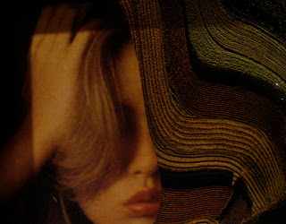
I am the Advisor for the Art Club at Utica College. One of the students came across "The Memory Project" on the web (see www.memoryproject.org). This is an initiative whereby disadvantaged children get a "portrait" of themselves drawn or painted by various artists (or art students) around the world. The students are VERY excited to be part of this project, as am I! Of course, there is a fee for doing this (which I told the students I would cover). What a great idea! Here is the photo of the child for whom I will do a portraiture collage. It'll be my first attempt at a representative portrait. I have some ideas in my head and I hope that the child will appreciate a collage (i.e., rather than a painting or drawing). It should be rather unique, I suppose. I will post the finished product when I complete it (not due until February... but I'm ready to get started). I've obscured the eyes as, understandably, we are not suppose to identify the children on the web.
Collaborative collage diptych
My cousin Dan Sanders and I have finished our collaborative collage project. We both started with the Queen Elizabeth element and did not show each other what we were doing until we were both finished (I showed the original "kernel" photo in an earlier post). So here's the finished product! We've entitled it "Two Queens". Dan works digitally until he has identified the elements he wants. Then he prints those elements and creates the composition. I consider myself an "analog collagist" and thus only use printed material from magazines and such. This piece will be on display at my upcoming two-person exhibit at The Black Gryphon Restaurant in Elizabethtown, PA (Dec. through March). Enjoy!
Friday, November 9, 2012
Spreading the "wealth"
I am teaching a creativity course this semester at Utica College. I convinced the students in the class to come in at 8:00 instead of 8:30 a.m. so that we could have a little extra time to spend on making collages. I think that they really liked the activity and they created some interesting collages. Here are a few samples and a great photo of the entire class showing off their works! Enjoy!
Wednesday, October 17, 2012
for fun
Here are a couple pieces I did "for fun" (i.e., again not putting too much pressure on myself to create a "masterpiece"). The owl piece I will give to a friend for Christmas. He has bought several of my pieces and I thought I'd give him a "freebie". He's an owl image/object collector; so he should like this one. The other piece I put together from some interesting elements I had lying around for a while. What's interesting is that my wife said that she liked it; but that it was a somewhat "predictable" kind of an image for me. I suppose it's been good for me to explore a little bit these days. Enjoy!
Tuesday, October 16, 2012
To The Power of N... again
Joel Lambeth has posted the latest artwork in the great Power of N project. Check out great works by prominent collagists at
http://www.tothepowerofn.joellambeth.com
Enjoy!
http://www.tothepowerofn.joellambeth.com
Enjoy!
Tuesday, October 2, 2012
Why?
Why do I do the things I do? Well, I mean... of course I am referring to collage... and more specifically the compositions I create. This weekend I spent some quality time in my workspace and in my creative space. I was perusing some old magazines (always a good strategy for generating ideas and getting inspired). I came across one specific issue of LIFE magazine from the late 60s (1967, I believe) which included a picture of a Chinese civilian being beaten by a police officer. In the 1960s and 70s the imagery which could be found in popular press articles in magazines like LIFE and LOOK and TIME was sometimes quite graphic. I wonder how the recent wars in Iraq and Afghanistan would have been perceived differently if that were the case today. Anyway... I was drawn to this image as a potential collage element. Later on in the same issue I came across a full-page advertisement for Hunt's catsup. As some of you know, I really like images of cross-sections of tomatoes. The juxtaposition of the man being beaten with the tomato background I found compelling. Why? I really don't know. The image is certainly edgy (to say the least). In a way, I feel that it is a little Ray Johnson-y (and perhaps reminiscent of Warhol's "Disaster" series). As I was working with the composition, I realized that there are a couple of ways to crop the image. I originally thought that I would crop the text of the advertisement out of the composition. BUT, as it turns out, the text is really interesting in terms of an additional juxtapositional element. I really don't have ANYTHING against Hunt's catsup (or any other Hunt's product) and I would hate to inadvertently convey something negative about Hunt's (which might be inevitable to a viewer). I am leaning toward not "causing trouble" by leaving the text in as part of the composition. Of course then I start feeling uncomfortable that I am self-censoring (no good for an artist). I am posting both versions to illustrate my "dilemma". Believe me, I am fully aware that this composition is edgy on a number of levels... but this is what has been occupying my time this evening; and I thought someone might find the process interesting artistically (if not aesthetically). There's more to this story as well; and I will post more soon. Enjoy?
Saturday, September 29, 2012
relax 'n' scraps
I was back in the studio last night and had a great time (and was productive too)! Here's a small piece (3.5 x 4.5"), the size of which was dictated by a set of small frames I got cheap at a garage sale (or auction?). I'm feeling like I can have a little more fun with these pieces as I'm not spending so much money matting and framing. The small size affords me the opportunity to experiment with some scraps I have laying around. I had the cut woman as a scrap because she was the back of another piece I used. Looking at that piece in isolation suggests that it wouldn't be too useful. When I found another scrap consisting of an aerial view of farm fields, I immediately saw the similarity in shapes and tone of the two pieces. I really liked the combination of the two. But the composition needed some contrast. I looked over at my scissors area and saw the "polyester" element sitting there. "Why not?" I thought to myself. But then it needed some balance (and perhaps color contrast). I think the final muted mauve "punch outs" did the trick. I really like the final product... and it came from "nothing but scraps". I think this was a good exercise for me and got me out of thinking that every step of a collage needs to be something "special". Enjoy!
Sunday, September 23, 2012
Sculpture Space CHAIRity Auction 2012
Thursday, September 6, 2012
black and white with "open" space
Here's a new one I "threw together" from some elements that I enjoyed. Again, I am trying to get back to a "make what I want" approach to my compositions instead of a "I gotta put together something impressive" approach. The former is what I had been doing for years and it seemed to be working. The "down-side" of experiencing some success in the art world I think is the transformation you go through from just "doing artwork" to "trying to do something". I hope that makes some sense as I have written it. Anyway, I had had a colored element added previously for contrast, but I rather like the monochromatic image better. I think it'll look great when it's framed too. I think I will entitle this one "Score!". Enjoy!
Tuesday, September 4, 2012
Creativity class
I'm writing this post to you from the sunny environs of my creativity class to show my students how to do a new post. Enjoy!
Monday, September 3, 2012
exploration
It has been TOO long (again) since I have been in my studio doing art. I had a very busy summer and have been concentrating on "school work" for a while now. A couple of cool projects are underway as well as the more mundane work that needs to be done. I am serving as the Chair of the Department of Psychology at Utica College now -- so that takes up additional time. But I have had some time to spend on artwork and have not really been doing it lately. I was beginning to think things like "am I done?"; "do I have more to offer?"; "am I still 'into it'"? I have also been a little intimidated lately because my studio space is such a cluttered mess. I mean, cluttered messes don't usually bother me (I think it's good for collagists), but it's been "clutterier" and messier than usual. I also have been feeling the down-side of my successes over the past couple years. I used to approach my art sessions with more 'open' feelings -- that is, a freer feeling of "just create!". Lately, I have been putting too much 'pressure' on myself to "create something GOOD". I have started a number of cool pieces that remain in my studio space "unfinished" partly because I don't want to "ruin" them; or I want to make certain I use "just the right element" next. I really think I need to just "chill out" a bit with all this stuff. These are the explanations of why I haven't been posting as much on this blog as I used to as well. I don't want my few followers to keep coming back to nothing new. Last night I spent several hours in "art space". I decided to just start doing something! None of these pieces will likely see the light of day (although I will continue with the "High octane" piece). I don't really like the other two. BUT, I thought I would post what I did ("warts and all") as documentation of my loosening-up a little bit and exploring some composition without worrying about "the next piece that will sell". I didn't do that when I started creating and I was very satisfied with many of my works (and they sold too!). So... for better or for worse, here are three things I worked on last night in my return to the studio! Enjoy!
Tuesday, August 21, 2012
The Power of 2? or The Queen Gets a Makeover
My cousin Dan is in from Guadalajara. He's been doing some collaging as of late and we've decided to embark on a little project akin to Joel Lambeth's "The Power of N" idea. Dan and I have decided to each use the same image (we both have the image shown here) and create two collages that we can put together as a diptych of sorts. We will not show the other what we are doing until we're done. It should be interesting to see what comes of this project. Check back soon to see the finished works!
Monday, August 20, 2012
Carry on
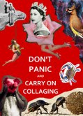
My cousin Dan, from Guadalajara, Mexico made this digital collage for me fashioned after the "Stay Calm; Carry On" sign that has recently become popular. Thanks Dan... I love it! Enjoy!
Sunday, August 5, 2012
painted and decoupaged furniture
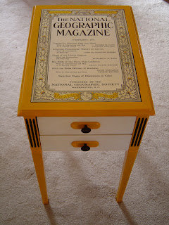
I spent some time this morning drinking coffee on the back porch and showing a friend some of the pieces f furniture I have painted in the past (mostly as donation pieces for the annual Sculpture Space "CHAIRity" auction). Mary Carol suggested that I post some of them... including "The Periodic Table Table" and the "Table of Contents". Enjoy!
Saturday, August 4, 2012
a couple new pieces
Now for the new work. Both of these works integrate multiple media unlike what I do most of the time. For the colorful piece I used an old book cover that I really liked. The second one includes a piece of car metal that I found while walking to work one day. Enjoy!
too long
It's been way too long since I have posted anything on this site... way too long. I have been very busy this summer with my academic work -- teaching at Cornell and working on a new prep for a class and trying to write a manuscript describing the research I conducted with colleague Dr. Tyson Kreiger. But I spent the morning reading a short book about creativity by Justin Kleon and the rest of the day in my workspace avoiding the oppressive heat and humidity. I happy now to have some things to post. First, the book. It's a quick read and quite nice. I would recommend it to anyone; but especially to a budding creator. Enjoy!
Saturday, July 7, 2012
Kurt Seligmann
Kurt Seligmann was an influential American surrealist painter who passed away in 1962. To commemorate the 50th anniversary of Seligmann's death, Jonathan Talbot curated an art exhibit this summer at the Seligmann Center in Sugarloaf, NY. My fellow collagist Julie Takacs and I both have pieces in this show. You can view the exhibit (and click on individual pieces for enlargement) at this website http://www.kurtseligmann.org/homage_exhibition/
(btw, I absolutely love this web design that enables you to 'click' on pieces and see them individually). Enjoy!
(btw, I absolutely love this web design that enables you to 'click' on pieces and see them individually). Enjoy!
Monday, June 25, 2012
two collage books
Over the past month, I received two new collage books that are so good, I just had to share information about them on this blog. One of the books is a technical book about various image transfer techniques by my friend and fellow collage artist Jonathan Talbot and Jessica Lawrence. The book can be purchased through Jonathan's website at www.talbot1.com. This book should be useful for any level of collage artist. The second book is written by collage artist Randel Plowman, who curated the Collage Masters book (what a gem!). Randel's new book is a wonderful in that it covers some design basics in the first half of the book and then presents 50 short exercises to stimulate creative thinking as it relates to collage making. It's a GREAT book and I highly recommend it for beginnings and experts alike. I am hoping to use it in the future with my students. The book is published by Lark Crafts. Randel's blog site is listed in the blogs I follow. Enjoy!
Friday, June 15, 2012
on-line now!
The 28th Annual Juried Exhibit of the National Collage Society is now up on-line. In addition to being accepted into the show, I won an "Award for Collage Excellence" (there were 21 award winners out of the 80 out of 528 submissions). Sorry for bragging a little... I'm ecstatic! Enjoy at: http://www.nationalcollage.com/2012exhibit1.html
Saturday, June 9, 2012
lapel pins
I worked a lot this week on school-related stuff and research, so today I wanted to get some work done in my studio space. Per usual, I have multiple project going on and some cleaning and organizing to do. I had no idea I was going to be doing lapel pins today; but it worked out that I pieced these together with the materials that I was getting organized. That's cool! These pieces are approximately 2" x 3" and 1.5" x 2". I made one for my friend Tom Nettle and the other for another friend of mine who, unbeknownst to me, has the snake as his Asian symbol. Enjoy!
Subscribe to:
Comments (Atom)


