Thursday, April 29, 2010

Rochester Contemporary Arts Center 6 X 6 show


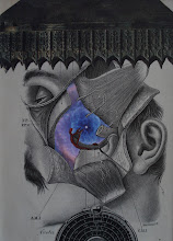
Since this piece needs to be delivered by May 2nd and I only found out about this event on Tuesday, I had to work quickly. The RCAC has a fund-raiser in June called "2010 6 X 6". Artists can submit unframed work which is 6" x 6" that patrons can buy for $20 (good deal!). Last year they had over 1500 (I think) pieces of art. Kinda cool I think. Check out their website. Here is my piece for the event. It's entitled "A taste of blue". Enjoy!

Monday, April 26, 2010

Images from Paris!

Ahh, I love Paris!
If you're interested, follow this link to see a video of this year's International Salon of Contemporary Collage in Paris in which I had two pieces. Ooh-la-la... I should've been there for the opening. Next year! Neither of my pieces sold and they are heading back home. I will exhibit them in PA before they come back for my solo show in Little Falls in September. Later this week I will be submitting images of two pieces for another European exhibit in July (You gotta submit Julie!). Enjoy! http://www.artducollage.com/expositionvideo/index.html
(BTW, the images shown to the right are what was exhibited at the show)

Monday, April 12, 2010

Black Gryphon exhibit!


My good friend Anthony Morgan owns a wonderful restaurant in Elizabethtown, PA called “The Black Gryphon” (www.blackgryphon84.com). He specializes in fresh food and admirably procures most of his food products from local farmers and growers. He also is an avid arts supporter who regularly hosts many impressive bands at his establishment. Anthony also features artwork from a new artist every quarter and does not charge commission on art sales! This weekend we hung an exhibit of over 20 of my recent collages. As a “bonus”, my older watercolor paintings (mostly now privately owned) are on view in the “back dining room”. If you are in the Harrisburg/Hershey area between now and the first week in August, stop by for some great fresh food and some interesting artwork. Hope you enjoy!

Saturday, April 10, 2010

Collage precis


I think this is a cool example of what I am looking at (for) when I am looking at the elements as I create a piece. Notice the three different placements of the dark circle element in the lower right hand portion of this collage. Two of the placements "don't work". The placement of the circle in exact center of the 3 x 3 matrix of the checkerboard pattern creates the illusion of a hint of a bigger square element. Interesting perhaps... but I thought it carried too much visual "weight". The other placement makes the edge of the circular element a bit obscure because it's placed against the dark squares within the checkerboard. The third placement worked best for my purposes, because it allowed just enough "weigh" to the element without drawing too much or too little attention. Do you agree? Enjoy.

Tuesday, April 6, 2010

Minimalism?


I've had this piece "done" for quite a while. The problem was that I was obsessing a bit about the fact that, although I really liked the piece, I thought that it should have more elements. The question is... "Why did I feel like it 'needed' more elements?" During the reception for the "Bits and Pieces" exhibit last October (curated by Jonathan Talbot) in New Rochelle, I saw some of Joan Hall's work and enjoyed it a lot. Her collages include a minimal number of elements; but the elements are exquisitely juxtaposed to create wonderful surrealistic images. Perhaps I was feeling guilty because one of my pieces included so few elements. Like maybe I haven't put enough work into it. Like maybe I was falling into the "anybody could do this" trap so many are prone to do when it comes to contemporary art (a la Barnett Newman and Mark Rothko). So anyway, I tried placing some additional images on this piece and nothing really seemed to work (I think the piece "knew" it was done ;-). And since I have an extended exhibit coming up in Pennsylvania, I needed to "finish" the work. I ended-up finishing it by leaving it as it was. I've decided not to "feel like I have to do something with it", especially since I like it as it is. The experience prompted me to further consider what it is we do as collagists. I am hoping that in another post soon, I will have time to address the creativity of simplicity. Hope you enjoy! (this piece is 8" x 10" an entitled "Happily...")