Saturday, February 27, 2010
Encaustic Workshop at Arkell
I thought I would share some photos of collage work that I saw while taking the workshop in encaustic technique at the Arkell Museum today. The piece with the feather and the elephant was created by Phil Palmieri. The piece with the antique white theme was created by my collage co-conspirator Julie Sadler. The piece with the butterfly and the gas station was created by Karen Katz, a jewelry designer from Cooperstown. The piece with the game board base was done by Karen's mother Salley Weinstein. Nice work from a group of very nice people. What a nice afternoon of creativity. Enjoy!
Friday, February 26, 2010
"Major"?
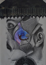
Okay folks... here it is! ...the piece to which I was referring when I said I was working on a "major" piece. My good friend Tom Nettle asked me a couple weeks ago, "So why are you referring to the piece you're working on as a 'major' piece"? Great question Tom! I'm not sure I have as great of an answer, but I'll attempt to explain. The initial inspiration for the piece actually came from the frame and glass. A lot of my "specimens" are collected in a place called Farmersville, PA in Amish country outside of Lancaster. Yes, that's the real name of the place. Anyway, I have gotten some great old medical and health books as well as vintage electronic manuals and maps and other ephemera at the weekly Farmersville auction. It's not uncommon for me to procure a box of these books for $2 or $3. I love it! It's really fun to see the Amish buggies parked outside of the place and see the integration of farmers and dealers and just plain ole folks like me (?) bidding on the mundane and the bizarre. I'm looking forward to going during my spring break. So this beautiful vintage frame with curved glass comes up for auction. Turns out, I got it for a mere $25. I was very excited, especially given that framing and glass is so expensive. I wanted to do the frame and glass justice by creating a special collage. Hmmm, maybe "special" is a better descriptor than "major". I know I wanted to do something with weird medical/anatomical components in the spirit of the Mutter Museum in Philadelphia. I was also excited to have the ability to make the piece more three-dimensional because of the curved glass. Well, this post is getting too long, so I guess what makes this piece "major" for me is the fact that I considered the framing to be so special, that I wanted to make sure the piece was special to match. I suppose I'll let you be the judge... but I really think the two do support each other quite well. Enjoy! Perhaps I will write more about the auction in a later post. I will be finishing another piece tonight that includes a significant contribution by my sister-in-law Sharon, who has a BFA in paper-making. Some interesting discussion about collaborative artwork to accompany that piece. Again... Enjoy!
Monday, February 22, 2010
Animated collage by Julie Sadler
Just a quick note to anyone who is interested. Check out the VERY COOL animated collage (and the description of the process) that Julie Sadler has posted on her blog at "collageclearinghouse.blogspot.com"
Thursday, February 18, 2010
ideas
A common question that I am asked by people who see my collages is this: "Where do you come up with your ideas?" (BTW, it is a great question for collagists, and I never tire of the question). So while we're waiting for the next couple of pieces to be finished with images to be posted, I thought I might take a minute and provide a couple of simple examples of some of the ways in which I am "inspired". Recently I purchased an OVER-sized book (it's probably 3ft. x 2ft!) with images of birds. I was looking in this book for a large-area of water to use as a background for a piece. As I was paging through the book I stopped at the peacock page. Such a beautiful creature and a great potential collage element. As some of you know, I am intrigued by older illustrations in medical texts. So I thought I would juxtapose these two elements and viola... an interesting "germ" perhaps for some future piece. Perhaps I'll use it in this way... or maybe I won't. But it is the spontaneity of these kinds of merging images that is one of the reasons I love collage. The other image that I've posted here is simply an image from an old medical/health text (circa 1915). This image will be used as an element one day. I will probably use it as a transfer within other elements of a collage. I just love the image in terms of its outer symmetry and the interesting human form "inside". It can also be used (sans text) upside down or right-side up. Hope you enjoy!
Two of my pieces are being shipped to France today... I'm excited!
Friday, February 12, 2010
Reorientation
This is just a quick update. I haven't been doing much collage work over the last two weeks. I was busy with school and getting the new office space for Mary Carol painted. Sooo, I started "reorienting" tonight and am ready to dig in tomorrow to try to get some pieces underway. I am working on a "major" piece that has the primary focus elements in place for the most part. The "background" is sometimes the most difficult part for me. My good friend Tom asked me a great question tonight. He asked, "What makes a piece a 'major' piece"? Now I hope I can "live up to" my allusion to "a major piece". And I will discuss why I am referring to this as a "major" piece (whether you agree or not ;-) in an upcoming post... soon.
Monday, February 8, 2010
CLIMATE/GALLERY
Folks, there were SO MANY beautiful collages at the "Putting-It-All-Together" show at the Climate/Gallery in Queens (the opening was this past Saturday). Anyone interested in collage should see this exhibit! Here is a sample of the pieces from the show (I apologize to the artists for not providing their names. The opening was PACKED and time was limited).
Pre-post (?)
I will be following-up on this "teaser" post; but I must say, if you are interested in seeing some wonderful contemporary collage in NYC, visiting the current exhibit "Putting-It-All-Together" at the Climate/Gallery in Queens is a must! What a great group of exquisite collages. Wow! I will share some photos this evening.
Wednesday, February 3, 2010
The abyss that divides the rich and the rest
Okay, this is a somewhat political post, albeit art-related post for this collage blog. The New York Times today reported that a new record has been set for the price paid for a single piece of art at auction -- Giacometti's "Walking Man" (1961). The price..... $104 MILLION dollars!!! Hey, I want artists to be paid for their work as much as anyone. And I don't want to dictate how people spend their money. But just like I believe that there is NO athlete worth a $100 million/10-year contract, I don't believe anyone should pay this much for a piece of artwork... BECAUSE I personally believe that $100 MILLION dollars could be better spent on medical help for the poor or to help 250 college students pay for tuition or to build 5 libraries for inner-city schools! Sorry for the politico... but the rich keep getting richer and the rest of us sit by and read stories like this about the arts. ARGH!
Subscribe to:
Posts (Atom)